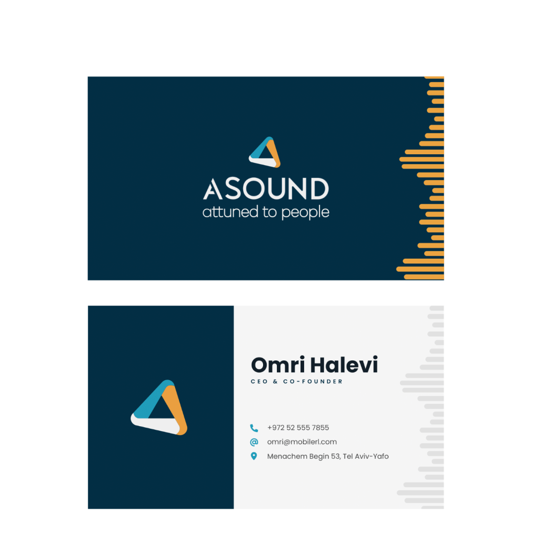
As part of a branding initiative for a program that uses the client’s location data to personalize advertising and marketing content, we developed a triangular element with three points to represent the app’s central idea of connection and matching. We also made illustrations for a wide range of use cases that will be featured in the app and accompanying marketing materials.
Steps
01
Research and characterization
After briefing with clients we understood what we to broadcast for the benefit of right and relevant branding that will be relevant for using the app and the system.
02
Logo creation
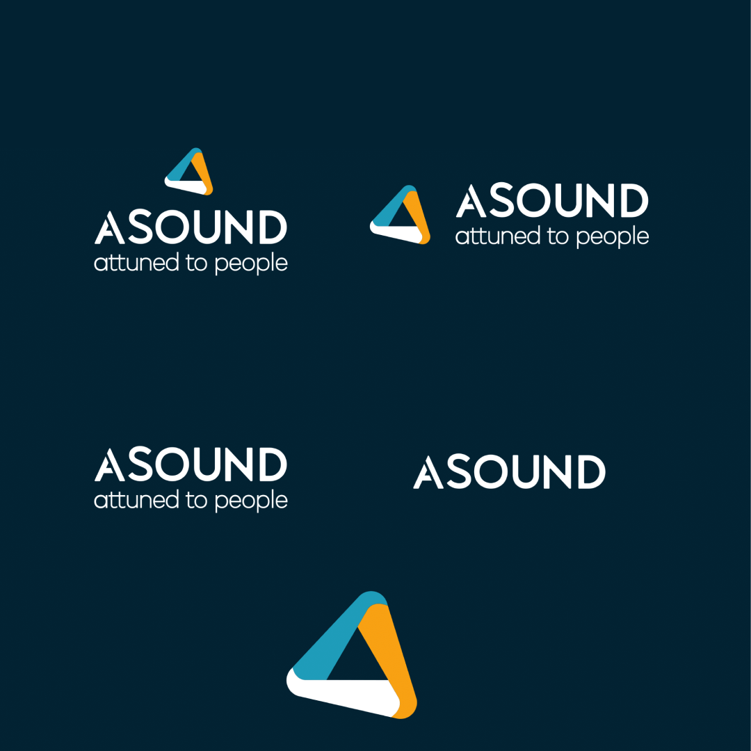
We formed an internal focus group, and after some initial designs, we settled on the connection symbol of the triangle as the best way to represent our long-term vision for the brand, the app, and the system as a whole
03
Creating elements and illustrations
We developed a standardized design language for all of the illustrative elements in the app and the system, maintaining the vibe of the brand throughout.


